
To some extent, no one really understands machine learning.
This is not a complicated issue. Everything we do is also very simple. However, because of some inherent "obstacles," we humans really cannot understand the simple things that happen in the "brains" of computers.
The long-term human physiological evolution has determined that we can infer two-dimensional and three-dimensional space. On this basis, we can also rely on imagination to think about the changes that have taken place in the four-dimensional space. But this is trivial for machine learning. It usually takes thousands, tens, or even millions of dimensions! Even if it is a very simple question, if we put it into a very high-dimensional space to solve it, it wouldn't be surprising if we do not understand the current human brain.
Therefore, intuitively experiencing high-dimensional space is hopeless.
In order to do some things in the high-dimensional space, we have established many tools. One of the large and developed branches is dimensionality reduction. It explores the technology of converting high-dimensional data into low-dimensional data and has done a lot of Visualization work.
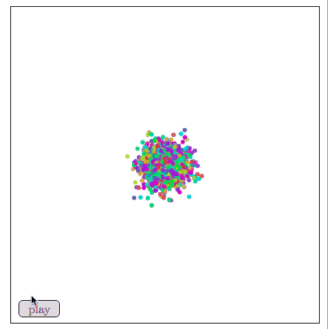
So if we want to visualize machine learning, deep learning, these technologies will be our basic knowledge. Visualization means that we can more intuitively experience what is actually happening, and we can also learn more about neural networks. For this purpose, the first thing we need to do is to understand dimensionality reduction. The data set we choose is MNIST.
MNIST
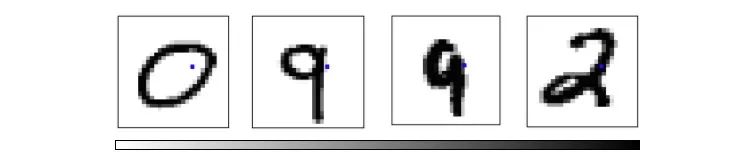
MNIST is a simple computer vision data set that consists of hand-written digital images of 28 x 28 pixels, for example:

Each MNIST data point, each image, can be seen as an array of numbers describing how dark each pixel is. For example, we can look at this handwritten number "1":
Because each image has 28 x 28 pixels, what we get is a 28 x 28 matrix. Considering that each component of the vector is a value between 0 and 1 that describes the degree of lightness and darkness, if we consider each value as a dimensional vector, then this is a high-dimensional space of 28×28=784. .
Therefore, the vectors in space are not all MNIST numbers. The difference between different pixel points is a matter of days and days. To demonstrate this, we randomly picked a few points from the image and magnified them - this is a 28 x 28 pixel image - the color of each pixel may be black, white, or shaded gray. As shown in the figure below, the random points selected look more like noise.

Images like MNIST numbers are very rare. Although data points are embedded in 784-dimensional space, they are contained in a very small subspace. In more complicated terms, they occupy lower-dimensional subspaces.
There are many discussions about the specific dimensions of the subspaces occupied by MNIST numbers. One of the prevailing assumptions in machine learning researchers is the manifold theory: MNIST is a low-dimensional manifold structure through which high-dimensional data is embedded in higher dimensions. In space, sweeps and bends form. Another hypothesis that is more relevant to topological data analysis is that data such as MNIST numbers have tentacles that are embedded in the surrounding space.
But what is the truth, no one really knows!
MNIST cube
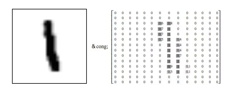
To explore this, we can think of the MNIST data point as a fixed point in a 784-dimensional cube. Each dimension of the cube corresponds to a specific pixel, and the data points range from 0 to 1 depending on the pixel intensity. On one side of the dimension is an image with white pixels, on the other side is an image with black pixels. Between them is a gray image.
If you think like this, the natural question is if we only see a particular two-dimensional surface, what kind of a cube would look like? Just like staring at a snowball, we can only see data points projected on a two-dimensional plane. One dimension corresponds to pixel intensity, and the other dimension corresponds to another pixel. This will help us explore MNIST in its original way.
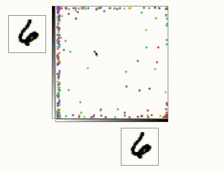
In the following figure, each point represents a MNIST data point, and the color indicates the category (which number). When we put the mouse over it, its image will appear on each axis. Each axis corresponds to a specific pixel shading intensity.
Exploring this visualization helps us to mine some information about the MNIST structure. As shown in the following figure, if the pixels with coordinates p18,16 and p7,12 are selected, the number 0 will be gathered in the lower right corner, and the number 9 will be concentrated in the upper left corner.
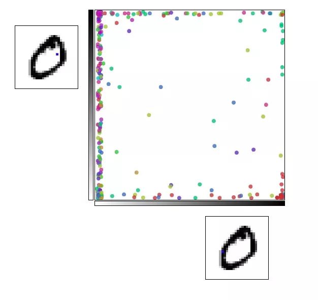
The red dot is 0 and the pink dot is 9
If the pixels at coordinates p5,6 and p7,9 are selected, the number 2 will appear in the upper right corner and the number 3 will be concentrated in the lower right corner.
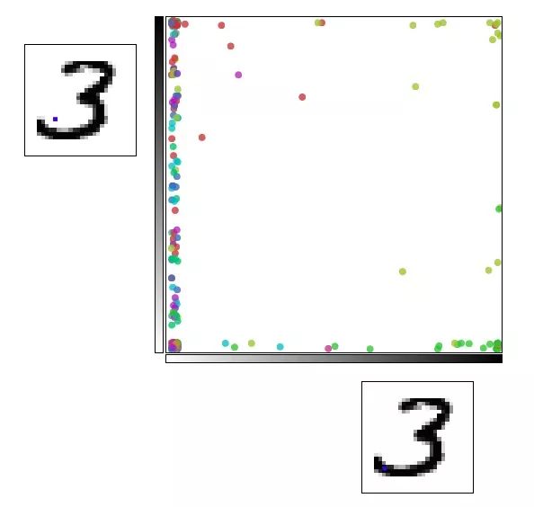
Yellow-green point is 2, green point is 3
This may seem like a small step forward, but we can't really understand MNIST in this way. These small discoveries are sometimes not convincing. They are more like a product of luck. Although there is very little information about structures that we can see from them, this way of thinking is correct. If we do not see the ideal data structure from the plane, then we may be able to observe this data from a certain perspective.
This led to the second question, how do we choose the right angle. When we look at the data in parallel, we need to rotate a few degrees. When we look at the data vertically, what should we do? Fortunately, this problem has been solved by someone who helped us - principal component analysis (PCA). PCA will find the most angles (capturing as many changes as possible) than manual calculations.
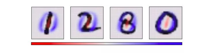
Looking at the 784-dimensional cube from a single perspective means that we need to determine the direction in which each axis of the cube is tilted: from this side to the side. Or two to the middle. Specifically, the following is a picture of two angles selected by the PCA. Red indicates that the size of the pixel is tilted to one side, and blue indicates to the other side.

If the MNIST number is basically red, it ends on the corresponding side and vice versa. We choose the first "main component" selected by the PCA as the horizontal angle, then push the point "most of the small red part of the blue" to the left, and push the "most part of the blue part slightly red" to the right side.
Now that we know the best horizontal and vertical angles, we can try to observe the cube from this perspective.
The figure below is basically similar to the previous one. The difference is that it fixes the two axes as the first "primary component" and the second "principal component", which is the angle of observation data. In the image on each axis, blue and red represent the different "propensities" of that pixel.
Visualize MNIST with PCA
Although the effect is better, it is still not perfect, because the MNIST data cannot be well arranged even when viewed from the best point of view. This is a very special high-dimensional deconstruction. The simple linear transformation cannot decompose the complexity.
Fortunately, we have some powerful tools to deal with such "unfriendly" data sets.
Optimization based dimension reduction
Here we are clear about the purpose of visualization - why do we seek "perfect" visualization? What should be the goal of visualization?
If the distance between data points in the visualization image is the same as their distance in the original high-dimensional space, this is an ideal result. Because of this, it means that we have captured the global distribution of data.
More precisely, for any two data points xi and xj in the MNIST image, there are two distances between them, one is the distance d∗i,j in the original space, and the other is in the visual image. European distance di,j. The cost between them is:

This value is a measure of whether the visualization is good or bad: as long as the distance is not the same, then this is a bad visualization. If the value of C is too large, it means that the distance in the visual image is very different from the original distance; if the value of C is small, it means that the two are very similar; if the value of C is 0, we get a "perfect" embedding. .
This sounds like an optimization problem! It is believed that any deep learning researcher knows what to do - select a random point and use a gradient to descend.
Visualize MNIST with MDS
This method is called multidimensional scaling (MDS). First, we place each point randomly on a plane and connect the point to the point with a “spring†of length equal to the original distance d∗i,j. As the point moves freely in space, this “spring†energy can Rely on physics to control the new distance within a controllable range.
Of course, this cost is not equal to zero, because it is impossible to embed high-dimensional space in the two-dimensional space with constant control distance. We also need this kind of impossibility. Although there are still some flaws, we can see from the above figure that these data points have already shown the trend of clustering, which is a significant improvement in visualization.
Sammon map
In order to be more perfect, here we introduce a variant of MDS - Sammon mapping. The first point to make is that there are many variants of MDS, and their common feature is that the cost function emphasizes that the local structure of the data is more important than the overall structure. When using a centered inner product to calculate the neighboring matrix, we hope that the original distance and principal components are equal. In order to capture more possibilities, the Sammon mapping approach is to protect smaller distances.

As shown in the figure below, the Sammon map is more concerned with the distance control of nearby points than if it focuses on two points farther away from each other. If two original points are one-half of the other two points, then they are “valuedâ€. The degree will be twice that of the latter.
Visualizing MNIST with Sammon Mapping
For MNIST, this method does not show much difference, because the distance of data points in high-dimensional space is not intuitive, such as the distance between the same number "1" in MNIST:

Or the distance between the different numbers "9" and "3" (less than 3 times the former):

For the same numbers, there are countless variations in the details on them, so their actual average distance is much higher than we thought. Conversely, for numbers that are very far apart, their differences increase with distance, so it is reasonable to meet two completely different numbers. In short, in the high-dimensional space, the distance between the same number and the distance between different numbers is not as big as we imagined.
Image-based visualization
Therefore, if we ultimately want to have low-dimensional embedded results, then the goal of optimization should be more explicit.
We can assume that there is a graph (V, E) that is closest to the MNIST distance. The nodes in it are the data points in MNIST, and these points are connected to the three points closest to it in the original space. With it, we can lose high-dimensional information, just think about how it embeds status space.
Given such a graph, we can visualize MNIST using standard graphic layout algorithms. Force-directed graph drawing is a method of drawing, which is to position the nodes of the graph in two-dimensional or three-dimensional space so that all the edges have more or less equal length. Here, we can assume that all data points are mutually exclusive charged particles. The distance is “springâ€. The cost function obtained after doing this is:

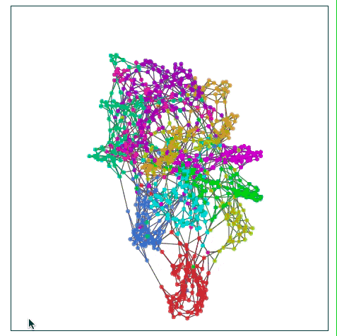
Visualizing MNIST with images
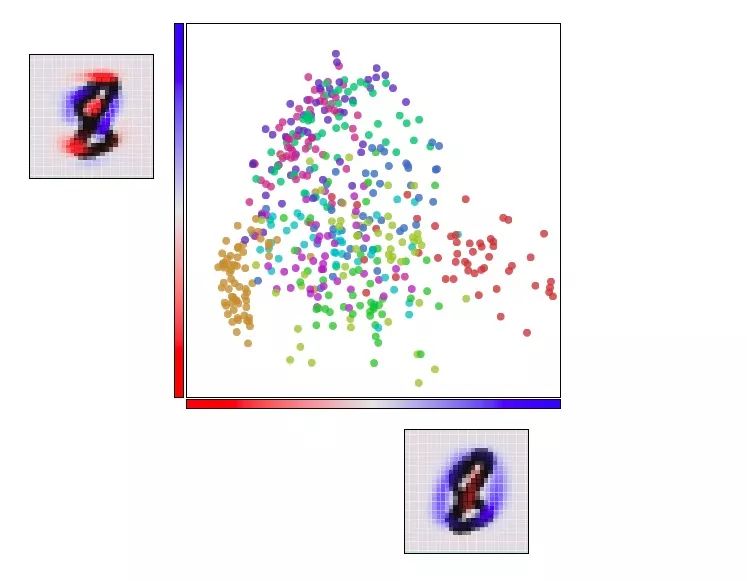
The above figure finds many structures in MNIST, especially it seems to find different MNIST classes. Although they overlap, we can find mutual sliding between clusters during image layout optimization. Because of these connections, they still remain overlapping when they are finally embedded in the low-dimensional plane, but we at least see the attempt of the cost function to separate them.
This is also an advantage of image-based visualization. In previous visualization attempts, even if we saw a certain point in a cluster, we could not determine whether it was really there. However, the image can completely avoid this. For example, if we check the clustering of the digital “0†data points colored in red, we can find a blue point “6†in it. We can see that the data points around it can be known. The reason why "6" is classified here is because it is written too badly and looks more like a "0".
t-SNE
t-SNE is the last dimension reduction method introduced in this paper. It is very popular in deep learning, but considering that it involves a lot of mathematics knowledge, we must first manage it.
Roughly speaking, what t-SNE tries to optimize is to preserve the topology of the data. For each point, it constructs a concept that other points around it are its "neighbors" and we want to try to make all points have the same number of "neighbors." So its goal is to embed and make each point have the same number of “neighborsâ€.
In some respects, t-SNE is much like image-based visualization, but it is characterized by converting the associations between data points to probabilities, which may be "neighbors" or not, and each point The degree of "neighborhood" is different.
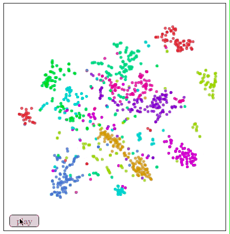
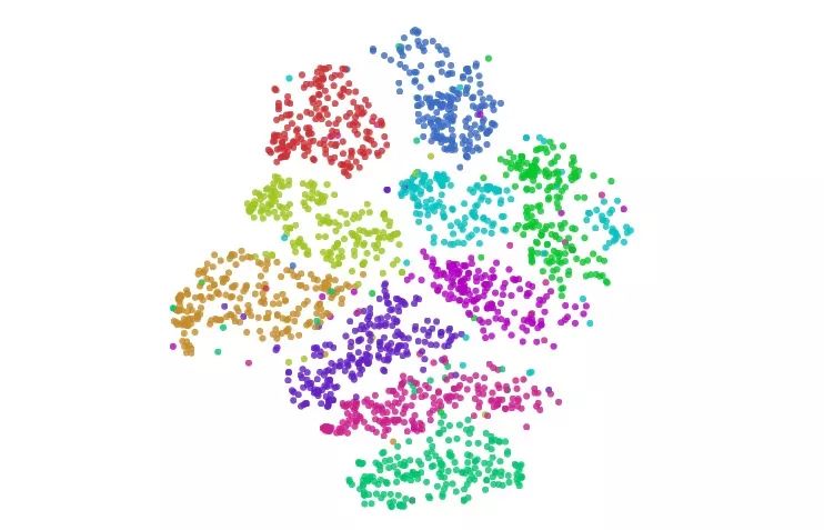
Visualize MNIST with t-SNE
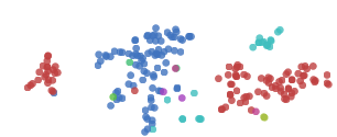
t-SNE usually shows excellent performance in revealing dataset clustering and subclustering, but it tends to fall into local minimums. As shown in the figure below, the red dots “0†on both sides cannot be clustered together because of the blue dot “6†in the middle.
Some tips can help us avoid these bad local minima. The preferred method is to increase the data volume. Considering this is a demonstration article, we only use 1000 samples here. If we use all MNIST data points of more than 50,000, the effect will be better. The other is to use simulated annealing, tune super parameters. The following figure is a better visualization:
Visualize MNIST with t-SNE
In Maertn & Hinton's (2008) original paper introducing t-SNE, they gave some more perfect visualization results, and interested readers can go for the first reading.
In our example above, t-SNE not only gives the best clustering, we can also guess something from the image.

Visualize MNIST with t-SNE
In the figure, the cluster of numbers "1" is horizontally stretched horizontally, and the data points are viewed from left to right. We observe this trend:

These "1" tilt left first, then upright, and finally to the right. One of the most plausible ideas for this is that in MNIST, the main factor in the same number change is tilt. This is probably because MNIST standardizes numbers in many ways, and these changes are divided into two sides by dividing the vertical handwriting. This situation is not alone, and the distribution of other figures shows this characteristic more or less.
3D visualization
In addition to dimensionality reduction to two-dimensional planes, three dimensions are also a very common dimension. Considering that many clusters overlapped in the plane before, we have also visualized some cases of MNIST digital dimensionality reduction to 3D.
MNIST (3D version) with image visualization
As expected, the 3D version works better. These clusters are completely separated and do not overlap when entangled.
Seeing here we can see why it is easy to classify MNIST numbers to about 95%, but the more difficult it is to go up. In the visualized image, the classification of these data is very clear, so all good classifiers can achieve the task goal. If you want to be more detailed, this is very difficult, because some handwriting is really difficult to classify.
Visualizing MNIST with MDS (3D Edition)
It seems that the 2D performance of MDS is better than that of 3D.

Visualize MNIST with t-SNE
Because t-SNE imagines a large number of neighbors, each cluster is divided more. But overall, it works well.
If you want to visualize high-dimensional data, it should be more suitable than 3D in 3D space.
summary
Dimensionality reduction is a very developed field. This article only captures the surface of things. There are hundreds of methods that need to be tested, so readers can try it out by hand.
People tend to fall into a kind of thinking easily and stubbornly believe that one of them is better than others. But I think most of the methods are complementary. In order to make trade-offs, they must give up one point to grab another point. For example, PCA tries to preserve the linear structure, MDS tries to keep the global geometry, and t-SNE tries to keep the topology. (Neighborhood structure).
These technologies provide us with a way to understand high-dimensional data. Although direct attempts to understand high-dimensional data using human thoughts are almost hopeless, with these tools we can begin to make progress.
M8 series connectors provides a wide range of metric for small Sensors and actuators.The ingress protection is available and rated to IP 67, these connectors are ideally suited for industrial control networks where small sensors are required. Connectors are either factory TPU over-molded or panel receptacles supplied with sold-cup for wire connecting or with PCB panel solder contacts. Field attachable / mountable Connector is also available for your choice.
M8 Connector,M8 Male Connector, M8 female Connector, M8 shielded connector , M8 angled connector
Kunshan SVL Electric Co.,Ltd , https://www.svlelectric.com